In recent months of giving presentations to both future and seasoned pharmacy practitioners, I have been able to garner a new category of feedback from audience members that was never the case previously. It has been quite interesting to gain a new focus of feedback for my presentations, but I think it speaks volumes to how far we have come and how far we need to go when it comes to the provision of medical education.
It all has to do with my slides. To be more specific, it relates to the aesthetic design of my slides. The new general consensus from members of the audience has been along the lines of the following:

One individual even followed up that comment with a remark highlighting the fact that because I am a millennial, it made that much more sense that my slides consisted mostly of pictures and short phrases as opposed to the traditional bullet-long list filled with words, words, and more words. Hmm…
Here’s the thing: Slide templates (as we know them) set us up for failure. Yes, for both our audience members as learners and us as presenters.
We all know what slide templates within PowerPoint have to offer us. I challenge you to open up any master template on PowerPoint to find anything other than a variation of the slide template below:
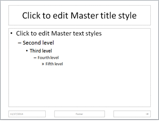
This is what most of us, millennial or not, have all been traditionally accustomed to since the very existence of PowerPoint. Some will (gasp!) include a graphic squeezed onto the slide right next to the bullet list to further highlight the information being presented. Others will go on to even use the template as the script for the entire presentation, leading members of the audience to focus on the content on the slides rather than the words being spoken by the speaker. Worse, the speaker may lose the attention of the audience altogether.
But does this bread-and-butter template have to be the default in the first place? And more importantly, is this aiding the learning of members of the audience?
Believe it or not, there is a science behind slide design, and a group of educators and research engineers from Penn State University has been publishing their findings on this very topic. Their extensive research in multimedia learning and cognitive psychology has led them to develop an innovative form of slide structure known as assertion-evidence slides. This form of slide design incorporates a two-pronged approach, as illustrated below:
- Headline: Contains sentence that highlights the main assertion of the slide; and
- Body: Visual graphic of the evidence that further elucidates the assertion statement of the slide (1).

In many ways, using this approach to design slides not only allows for the speaker to streamline and focus presentation of key concepts aimed to enhance the learning of the audience member through the elimination of disjointed concepts that otherwise may be incorporated through the use of a bulleted list of items, but it also allows the learner to synthesize connections between the assertion statement and the visual graphic (2, 3). To ensure that your audience has not missed any of the finer points of your presentation with information that may not be directly found within the slides, you may want to create a supplemental handout with references and such.
There have been relatively few studies published on the topic of learner assessment associated with assertion-evidence slide design (4, 5) but the findings of those that have been thus far have demonstrated superior long-term retention of the content of such presentations in contrast to traditional slide templates.
Now, granted, much more time, thought, and creative effort is required to be dedicated in designing such slides. (Who knew less is more? But I can tell you from firsthand experience that this indeed is very true.) However, in the long run, we are doing our learners a favor by portraying the information being presented in such a manner that facilitates their learning needs.
At the end of the day, members of the audience should not forget that slides exist to serve as the backdrop to illustrate the story that the speaker is telling as part of the presentation.
References:
- Rethinking Presentation Slides: The Assertion-Evidence Structure. Available at: http://writing.engr.psu.edu/slides.html. Accessed November 18, 2014.
- Garner J, Alley M. PowerPoint in the psychology classroom: lessons from multimedia research. Psychology Learning & Teaching 2011; 10 (2):95-106.
- Garner J, Alley M, Gaudelli A et al. Common use of PowerPoint versus assertion-evidence structure: A cognitive psychology perspective. Technical Communication 2009; 56 (4):331-345.
- Garner J, Alley M. How the design of presentation slides affects audience comprehension: A case for the assertion-evidence approach. International Journal of Engineering Education 2013; 29(6):1564-1579.
- Root Kustritz MV. Effect of differing PowerPoint slide design on multiple-choice test scores for assessment of knowledge and retention in a theriogenology course. J Vet Med Educ 2014; 41(3):311-317.
